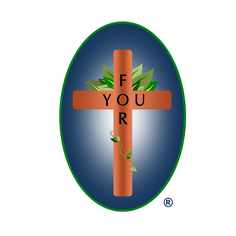
His Love For You Cross Logo
The Story of How the Logo Came About

The FOR YOU word design on the cross came to mind one day as a result of a heart experience with God.
Growing up in a fairly decent religious environment it was easy to become part of what the family believed about God in general. God loves everyone and Jesus died for everyone. I was a small part of everyone. The Bible says all this stuff. I believed the Bible. Christianity was a one size fits all, feel good, feel safe, day to day going through the motions religion.
It was easy to assume one’s standing before God was guaranteed Heaven bound. Why? Because of all those tender religious practices you went through by those who deeply loved you and your general belief in those same things. Yet one day the kindness of the Spirit of God moved to make this heart aware this life needed more. He needed Jesus personally. It was wake up time.
It happens when the Spirit of God taps you on the shoulder of your heart and says, “You don’t really have Me.” At the same time for the first time in your life you see Jesus on the cross looking at you saying, “I love you.” Such divine love “For You” becomes overwhelming and deeply personal forever. To turn to God and receive such love into one’s heart, accepting the sacrifice of Jesus’ shed blood for your life and your sins, sets you free in Jesus Christ!
The coming together of the art work for this logo of the cross was an exciting adventure in team work. Absolutely want to give God’s Spirit all of the credit along with my web designers, two wonderful graphic designers and yours truly, as one thought built upon another. Thank you to all of you!
The Design Elements
the Cross
Having gone through other ideas that were quite nice and almost there, the computer screen one night was just looking back at me saying……well, now what? The verse in Revelation 4:3 about Jasper and Carnelian came to mind.
These are colors of the appearance of the One who sat on the throne. The thought wouldn’t leave. More than five neurons were beginning to fire as research went into what these colors looked like. Finding gem quality colors of carnelian got things going.
Different Bible translations use different words for Carnelian such as Ruby. So it was that carnelian was chosen and became the color for the cross.
The Leaves
Looking at the thought of green leaves presented the thought of the resurrection and life springing up from death. The relationship with God now restored brought another thought of each believer in Jesus returning to their own personal Garden of Eden with God.
The thought of Jesus being the true vine came to mind and had to be part of this.
The Border
The eternal glory and brightness of God’s Royalty, His Majestic light shining through brought it together. The emerald green border came to heart from the last part of Revelation 4:3. It speaks of a rainbow that appears as an emerald and encircled His throne. There you have it, the logo story.
Everywhere we look God displays His great glory. This world is very broken, deeply hurting and desperately needs the only Savior who took sin and death and defeated it. The Spirit of God is working in the lives of people every day. Jesus is coming back soon, and will make all things new! We all need to be working, watching and ready!


